Critique my floorplan

Van Living Forum

Help Support Van Living Forum:

This site may earn a commission from merchant affiliate links, including eBay, Amazon, and others.

Firebat45

Member
Joined
Jul 26, 2021
Messages
7
Reaction score
0
Hi all,

I have been living fulltime in my E150 for a while now, and while it's okay, the low roof is starting to wear on me.  I primarily spend my nights stealth camping downtown in a large city near my work, so being inconspicuous is a high priority.

I've just picked up a low/standard roof Sprinter with a 144" WB.  Getting ready to build it out and I'm trying to design a more functional layout that I currently have.

Some info about me/my requirements:

- Tall and Single - While a Queen bed is nice, I am perfectly happy with a Twin XL (40x80)

- I ride an EUC, so I need a garage area, but it doesn't need to be very big.  About 24"x 10", and 26" tall.  The EUC does need to store vertically, so that mud and snow drain down instead of pool inside.

- Stealth is a super high priority, so I have to have a full partition and can't use the front of the van with swivel seats or anything to add to my space

- I plan on hydronic heating and AC

- I have been using a Thetford cassette toilet and I really like it.  I think the only thing I'd prefer is an electric or diesel incinerator toilet, but I don't think I have room for either.  Right now I plan to reuse my C403L with right side access, since I can't find a C263 that will ship to Canada.

- I live in Northern Canada and it gets to -40 every winter.  Last winter was worse.  So no underslung water tanks, good heat, and good insulation is a must.

- Avid computer user.  I like to game in my off-time, so I'd like a decent area to play games.

- I strongly prefer a permanent bed.  Murphy beds are interesting, but I haven't seen a low-roof setup with a Twin XL that gains enough space to be worthwhile.

- I will be putting a recirculating shower system in, like a showerloop


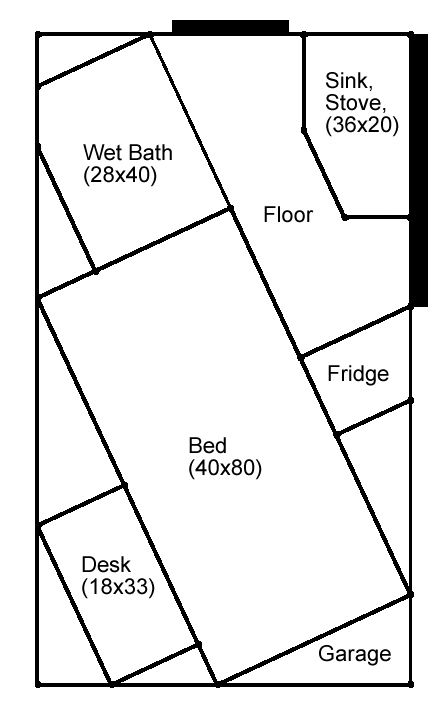
So anyway, I was spitballing and came up with this concept (Large black areas signify cab access and slider door):
iBpNb4E.png


Very unconventional, but it's got some benefits.  It is drawn to scale to fit the Sprinter.

One big benefit - Decent sized walking space between bed, bathroom, cab access, and side door.  I haven't been able to come up with any other design that approaches this.

Great desk size, with the bed for a seat.  No seat back, but I am used to sitting like that.  

Perfect little garage for EUC, accessed by the "master" rear door"

Fridge, sink, and stove all in close proximity to outside through the slider door.  Nice for when I do go camping or am in a more private spot.  Also nice for loading groceries in.

Full wet bath area.  Will have to do seated showers due to the roof height, but the Thetfords are fine in wet locations.


The downside is obviously these triangle spaces all over.  Triangles are hard to utilize nicely.  However, I think I could use most of them:

- The two around the bathroom could be used for pumps and filters for the showerloop, hydronics, and water heater. 

- The two at the rear of the van are a great place to put electronics like solar chargers, inverters, etc.  Can be easily accessed with the secondary rear door for maintenance.

- That leaves the two large ones on either side of the bed, which I was thinking I could use for cabinets/wardrobes for clean and dirty laundry, separately.

- And finally, the underbed space could be used for storage and fresh/grey water tanks.

Am I crazy for thinking this wierd triangle layout might work?  Does anybody know of a similar floorplan (bed mounted non-orthogonally)?  I think it could give the interior an interesting feel, too.
 
One thought that comes to mind for me is that it does not take advantage of the side walls for stability. So these walls will need to be somewhat rigid. But with lots of plywood you can get that with your triangle spaces.
 
So you'd have to open the side door all the way and then do the hokey-pokey around the sink/stove in order to enter and exit? That might get old rather quickly. How about swapping places with the fridge?
 
My 1st rig required 2.5 rebuilds to be functional. Fortunately when I got my 2nd rig I had learned a whole lot and it definitely shows... but still could have altered a few things.

I would suggest that you get some scrap cardboard and some foil tape and do a to scale layout.

Paper is a good start. Tape on the floor is better but to truly understand the flow you can not beat cardboard.

You will also be able to estimate your materials and costs better by doing a cardboard mock up.

My first rig probably about 40 visits to home Depot and other stores...2nd build??... just 4!
 
Welcome to the CRVL forums! To help you learn the ins and outs of these forums, this "Tips, Tricks and Rules" post lists some helpful information to get you started.

Most of our rules boil down to two simple over-riding principles: 1) What you post should provide good information (like your introductory post), and 2) Any response to someone else's post should make them feel glad they are part of this forum community.

We look forward to hearing more from you.
 
Looks to me like you'd have to crawl over the bed and the desk in order to get to your desk chair. That would drive me nuts in a very short period of time.

Also, I'm assuming you would be using the "orphan" spaces for storage? Those very pointy corners would be difficult to use efficiently.
 
This would give an engineer nightmares.

For whatever reason you may like this, it is definitely not an efficient use of space.
Considering that space is at a premium in the confined spaces of vanlife you may want to reconsider.
 
"What’s an EUC?"

Yeah, what is an EUC? I have kinda backed off the anti abbreviation thing.

Highdesertranger
 
What is the purpose of the diagonals? Squaring would use the same space more efficiently. ???
 
Why leave empty space triangles by building everything as a rectangle? Just make the desk and the bath to conform to the area instead of every thing being a 90 degree angle. Do not waste space. You can still have an angled layout without squaring  up the sides of every object you put in there. Buy yourself a large adjustable angle drywall T square. Use that to layout the cutting lines on materials. Skill saws, table saws, jigsaws can all do angled cuts. Drafting programs can draw it out and give feed back on what those angles are which reduces the math phobia.
 
MrNoodly said:
So you'd have to open the side door all the way and then do the hokey-pokey around the sink/stove in order to enter and exit? That might get old rather quickly. How about swapping places with the fridge?
Yes, it would be slightly better to be able to enter/exit at the front of the door's travel instead of the rear.  Unfortunately, that takes away from "bed frontage" space and limits cabinet access as well. 

Cammalu said:
I don’t get it.
Thanks for the input? 

jacqueg said:
Looks to me like you'd have to crawl over the bed and the desk in order to get to your desk chair. That would drive me nuts in a very short period of time.

Also, I'm assuming you would be using the "orphan" spaces for storage? Those very pointy corners would be difficult to use efficiently.
Yes, that's the number one thing I don't like.  Having to crawl over the bed to get to the desk.  Unfortunately there isn't enough space to do it differently. 


PeterPiper said:
This would give an engineer nightmares.

For whatever reason you may like this, it is definitely not an efficient use of space.
Considering that space is at a premium in the confined spaces of vanlife you may want to reconsider.
It might seem that way, but I'd love to see an alternative that gives me more usable space.  I've done several designs the "conventional" way that don't offer what this does.  I'm currently living in one, so you can be assured that I do consider the confined spaces carefully. 


highdesertranger said:
"What’s an EUC?"

Yeah,  what is an EUC?  I have kinda backed off the anti abbreviation thing.

Highdesertranger
Sorry, it stands for Electric Unicycle.  They are about the size of a suitcase or carry-on luggage.
 
I can see your point and have run into the same problems when living in a yurt or a tent with sloped sides, unfortunately most things in our world are squares in order to not waste space. If you make the bed three sections you may be able to convert it into a chair that takes up less space during the day and possibly fold and pivot the desk top against the wall. Rounding the corners on other components will make movement easier and more open but again you will loose some storage space it you can't adapt what you store from square to round containers that match the curves.
 
Ok you asked for it, it is a dumb design. My wife does this with beds,kitchen, tables,couches,it takes up too much space, she thinks it looks cool, a matter of opinion. If you want more floor space which is the right way to go, turn your wet area the other way push the bed against the wall, make it retracting/folding, put the desk on thé other side, I would make your bulkhead so it bi-folds so you can swivel your front seat when weather and situation permits. Round walls, angles are a nice touch but not efficient especially in a van living full time. Don’t try to reinvent the wheel. The westfalia design is one of the best. Tried and true. The biggest mistake imho builders make in vans is making them feel like narrow hallways with very little floor space, with no windows they feel like small walk in closets. Large upper cupboards, permanent beds, wide lower cupboards are the major culprits. Back to the drawing board. I think you have all the parts you just have to shuffle them around.
 
^^^"If everyone is doing it, then why the Hell should I" The answer is it works for most people! Lol!!!
 
So are you unsure about your floor plan yourself? If you are unsure then what about it is bothering you?
 
bullfrog said:
I can see your point and have run into the same problems when living in a yurt or a tent with sloped sides, unfortunately most things in our world are squares in order to not waste space. If you make the bed three sections you may be able to convert it into a chair that takes up less space during the day and possibly fold and pivot the desk top against the wall. Rounding the corners on other components will make movement easier and more open but again you will loose some storage space it you can't adapt what you store from square to round containers that match the curves.
Rounded corners is a nice idea, it would probably prevent some injuries as well.  I'm just not as sure about how easy they would be to fabricate.

flying kurbmaster said:
Ok you asked for it, it is a dumb design. My wife does this with beds,kitchen, tables,couches,it takes up too much space, she thinks it looks cool, a matter of opinion. If you want more floor space which is the right way to go, turn your wet area the other way push the bed against the wall, make it retracting/folding, put the desk on thé other side, I would make your bulkhead so it bi-folds so you can swivel your front seat when weather and situation permits. Round walls, angles are a nice touch but not efficient especially in a van living full time. Don’t try to reinvent the wheel. The westfalia design is one of the best. Tried and true. The biggest mistake imho builders make in vans is making them feel like narrow hallways with very little floor space, with no windows they feel like small walk in closets. Large upper cupboards, permanent beds, wide lower cupboards are the major culprits. Back to the drawing board. I think you have all the parts you just have to shuffle them around.


[size=small][font=Tahoma, Verdana, Arial, sans-serif]Thanks, you've actually got some good points.  My original design did have the bed and wet bath pretty much right where you describe.  I can't extend the bath all the way to the bulkhead (at least not at 40" wide") because that impinges on the passageway between the front seats.  It could be curved or sloped though, I suppose.  I really like your idea of a large bulkhead door or removable bulkhead to allow seat swiveling.  I wouldn't be able to do it all the time, but it would add a lot of usable space when I could.[/font][/size]

[size=small][font=Tahoma, Verdana, Arial, sans-serif]My initial design for this van did seem very much like a narrow hallway, which I don't like.  It's what I dislike about my current build, too.  It's part of what I like about the goofy triangle plan, the walkways are wider and I wouldn't have a lot of overhead cabinets.  I am pretty set on having a permanent bed, even though it would make things a lot easier if it folded up or turned into a dinette.  I hate having to set up twice a day.  [/font][/size]

maki2 said:
So are you unsure about your floor plan yourself? If you are unsure then what about it is bothering you?

I like the floorplan more than anything else I've seen.  I'm just uneasy about triangles, but I've always thought that triangles are inefficient.  Even though here it seems to work.  I just wanted some outside opinions, already there's been some comments that have given me some new ideas.  I'm still fairly sure I like the angled design, but I will be tweaking it some more.  There's been a lot of hate for the design too, which is fine.  But most of it seems to be reactionary "triangles bad!" without giving much thought to it.  Sure, you can say triangles are inefficient, but if you evaluate the overall design and it works better than a orthogonal one, then obviously that's not always the case.  Boatbuilders manage to make lots of designs with triangles.
 
Does the desk for your gaming need to be permanent? I wonder if something more movable like a Lagun table would work instead. You could put mounts on both sides of the bed and move the desktop to suit your convenience. When it was on the kitchen/fridge side it could also serve as extra counter space.
 

Latest posts

Top